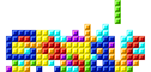
New Tetris Google logo
June 6th, 2009
Must be a new record set in bad readability for those logos. I wonder if they actually played (super wide) Tetris to achieve that logo. If so, they deserve some creds for ending p with something that at least looks a bit like a Google logo. But if it was designed this way… Someone needs to be dropped down a well.
![You suck at protoshop. No, you [i]really[/i] oo.](http://blog.gg8.se/images/you-suck-at-photoshop-you-really-do-your-awful.png)


June 6th, 2009 at 10:40 am
yea i agree if it was designed that way someone got lazy or something.
June 11th, 2009 at 9:57 pm
Good call, at least I’m not crazy for not being able to see anything but “G.”
June 23rd, 2009 at 10:24 am
My guess is that they tried to make it look like they have actually played Tetris to make it. Obviously, that’s not the case since some of the blocks aren’t ‘real’ Tetris blocks.