![You suck at protoshop. No, you [i]really[/i] oo.](http://blog.gg8.se/images/you-suck-at-photoshop-you-really-do-your-awful.png)


Gameboy project week 1: More than four shades of green
January 6th, 2013I’m hereby announcing 2013 as the “one Gameboy project per week” year. This an idea I came up with during a discussion with Seb (little-scale) where I jokingly suggested it as an alternative to the usual “one song per week” type challenges. So, my challenge is to try to do some kind of Gameboy-related project each week. Some of them will be more practically useful projects, like music/noise making ROMs, while others, like this week, will be research projects that I’m doing out of my own curiosity. This week’s project was actually meant to be a different project, but I postponed doing it, and had to settle for a smaller project to have a finished project at the end of the week. (Off to a bad start already. :p )
There’s a big risk this whole project will fail somewhere along the way. If not for lack of motivation (most likely) then because of lack of ideas.

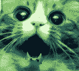
Look at this cat. Just look at it! I found this image as a reaction image on the chanz, and you might notice that the aspect ratio is almost perfect for a Gameboy screen. So said and done, I resized it to the correct resolution, reduced the image to 4 bit color and converted it to Gameboy tile format, and wrote some code to display it on the screen. Since the image is a photograph that has not been especially made to be displayed on a low-bit console, it ended up using more than 256 unique tiles. This required the code to make a switch between the tile sources mid screen. Nothing too fancy, but I might explain what this means at a later point.
 Cool, but perhaps not interesting enough in itself to qualify as a project in itself. I was a little annoyed by how the noise diffusion looked. (Right image.) Of course, this is the nature of these things, but can anything be done about it? Obviously, yes, since I’m asking the question.
 ![]()
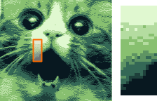 The answer is to move the image back and forth by 1 pixel every frame. On almost any newer type of display, including the craptastic display of the Gameboy Color, the result of this is an image that flickers horribly. Thanks to the DMG LCD’s laggy response, however, you get interpolation between the different shades, which I’ve simulated here on the left. In other words, you’re effectively creating a horizontal blur. Those pixels that have a shade between the usual four shades are the pixels that change between the frames when the image is moved.
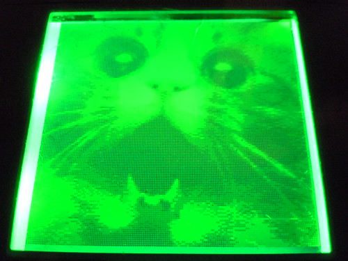
Below is a photo of the ROM in action. The effect doesn’t show up very well on camera, however.
Still not entirely project-worthy. So I thought I’d try something I’ve been wanting to try for a while, which is to make a greyscale gradient that is as smooth as possible on the DMG LCD, using a similar technique. You can easily make a 4 color gradient which simply divides the screen into four divisions.
So the screen is divided into the following:
Shade 0
Shade 1
Shade 2
Shade 3
(Here numbered from 0-3 because that’s how the hardware does it.)
Can we do better? Obviously. We can easily create three more subdivisions where we each frame alternate between two colors. So between shade 0 and shade 1, you place a region that you switch between shade 0 and shade 1 each frame, making it appear to the eye as a shade between shade 0 and shade 1.
Shade 0
-Shade 0/1 50% blend
Shade 1
-Shade 1/2 50% blend
Shade 2
-Shade 2/3 50% blend
Shade 3
Can we do better? Yes, we can, by the same principle, set a pixel to shade 0 for two frames, then set it to shade 1 for one frame. The naïve way of doing this for a large portion of the screen with a solid color, and change that color for two, then one, then two, then one frames. However, this introduces a problem, flicker. Since this is a three frame animation at the Gameboy’s ~60 FPS frame rate, the resulting animation is ~20 FPS which is right below the eye’s comfort zone. Fortunately there is a solution.

By using a moving pattern instead of a solid color, each frame has the same average intensity, and the animation doesn’t appear to flicker as much. The image will however appear to move from one side to the other, which may be more or less annoying than the pure flickering. (I’ll have to investigate this further, but for the time being, the ROM is using the pattern method and I’m done for today.)
With this method you now have another degree of precision between every shade previously noted.
Shade 0
–Shade 0/1 33% blend
-Shade 0/1 50% blend
–Shade 0/1 66% blend
Shade 1
–Shade 1/2 33% blend
-Shade 1/2 50% blend
–Shade 1/2 66% blend
Shade 2
–Shade 2/3 33% blend
-Shade 2/3 50% blend
–Shade 2/3 66% blend
Shade 3
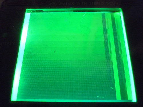
This gives you a whopping 4+3+6=13 different possible shades of green that you can use. Here you can see it in action on a backlit DMG:
Conclusion: Is there any practical use for this?
If you want to produce photorealistic (yeah right) images, and you want to do it right and not just slightly blur a 4 color image as above, you have to have 2-3 frames of animation (depending on the desired emulated color depth) which limits the size the image can have. Let’s assume you go for the 13 shade option and your image is “photorealistic” so that no tiles are reused. This would give you 128 usable tiles. (Multiply this by 3 for the three frames of animation to get 384, the total number of tiles available on a DMG.) 128 tiles can for example be arranged as 16*8 tiles or a 128*64 pixel image. (Actually, using just 3 frames would just give you the 33% and 66% shades in the table above, so a total of 9 emulated shades.) In short, useless for photorealistic images, other than as a proof of concept. (Which I may look into creating later.) However, it may have potential for art designed specifically with the tile constraint in mind.
As for gradients, they may be useful, and look better, if the lines are more closely spaced so the gradient seems more continuous. Even so, the DMG screen is kind of crap. The slow refresh time is of course a blessing because it makes this effect at all possible, but it’s also a curse because it means the display overall will suck.
Finally here are the ROM images in case you want to check them out:
Cat
Gradient
If you wish to use the ROMs with an emulator, use BGB. I recommend you turn on frame mixing in the graphics preferences. If you wish to use the ROMs on hardware, be advised that they work best on DMG hardware and worst on GBC hardware. I would like to hear some feedback about how they look on a Gameboy Pocket, especially the gradient ROM.
January 7th, 2013 at 1:36 pm
Very Interesting. Can’t wait for 51 more Gameboy projects.
January 7th, 2013 at 4:37 pm
I just tried the gradient on pocket and it looks great
January 7th, 2013 at 4:41 pm
ashimoke: Care to share a photo of how it looks on a Pocket, if you can?
November 8th, 2014 at 12:05 am
This is really amazing!
Is there a way load prepared (resized, 4bit etc) via a rom to display on original DMG hardware?
I’d love that option so much I’d pay money for it